
In general this email is fine but with two glaring errors in my view that kill any chance for the recipient to appreciate what’s here.
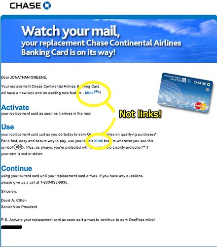
As you can see from my callouts, the blue text in the paragraph highlighting the “what’s new” feature is NOT a link. Why? Why make it different and not provide a way for me to learn what the heck you are even talking about?
(I’m pretty sure that blink is the RFID / NFC system that lets you tap and pay with the card instead of swiping and signing… guess I’ll have to wait and see.)
Technorati Tags:
email, marketing, Chase Bank, blink
Personally I think its because this is a logo and not what they think should be a link…
what they do fail to give is any link at all !
There should be one at the bottom a “Call to action” in marketing speak
It goes to show they are not tracking the responses at all and therefore dont measure marketing dept so those christmas bonus’s are hard to justify…
John
EXACTLY! It’s a broadcast only message … lame!