

It seems almost crazy to see a massive piece on Google design given the history but if you’ve been using Android recently you’ve probably noticed some great things. I’ve discussed the differences between iOS and Android quite a few times and the more you use things on both platforms the more things that might seem like small details start to add up …
Examples like these happen everywhere in iOS, and they’re painfully obvious when compared to Lollipop, the latest version of Android. There, your notifications appear in a drawer, again from the top of the phone. But every one takes you directly to an action inside an app, making it foolproof to get into maps or Uber or Facebook. There’s intelligence behind what you see: A algorithm that invisibly figures out what notifications are most important to you, and serves those up first. There are hardly any chances to swipe wrong. You won’t end up in a place you hadn’t expected. In so many places, Android is so much more logical, the details so much more alive. Tapping any button sends a wash of color across the screen, like a ripple across a pond—a smart way of underscoring your taps, while hiding the teensy bit of lag that occurs as you wait for app to response.
Such attention to detail used to be Apple’s thing. Today, that distinction falls to Google. Unveiled last year, Material Design—Google’s evolving design language for phones, tablets, and desktop—offers relentless consistency in interactions; invisible rules that govern everything, so that every app feels familiar; and beauty in the service of function. It’s why so many designers will tell you, as they’ve told me, “I just like Android better.” Whereas iOS is still inching along without improving much, Google is creating a coherent, unified language that easily scales across phones, with enough flexibility to jump to watches and cars. “It’s not even about composing a UI in one place,” says Nicholas Jitkoff, who helped lead the creation of Material Design. “It’s about composing interactions from one device to the next.”
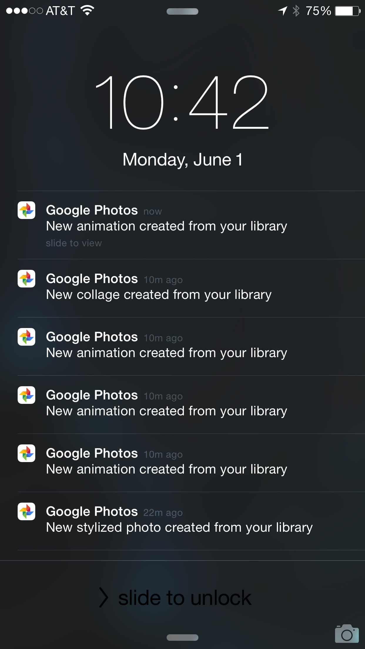
When I woke up this morning there were over 100 notifications on my iPhone lockscreen from Google Photos which is processing the 90,000+ photos uploading from our home computer. There were quite a few additional bits from other apps like email and news I use but a single action of opening / unlocking the device and they are all gone … Forever. On android things are nicely packaged together and importantly are not destroyed if I swipe in or act upon a single piece.
The considerations that have evolved in Material Design and that consider to evolve are very clearly focused on the ever changing waybin which we use our devices. It’s easy to say there is copying going on between the two key platforms but that misses the important nuances that really highlight the focus Android has on enhancing the real user experience.